View all
Web DevelopmentMobile Development UX/UI DesignStaff Augmentation CTO as a ServiceDedicated TeamLow-Code DevelopmentThe UX Design Pyramid: How to Prioritize User Needs in Your Product
Client Guides
Design

Aug. 05, 2026
13:30 min to read
-1785919003202.webp)
Table of Contents
What Is the UX Design Pyramid?
The 5 Layers Explained: User Psychology & Metrics
How to Apply the UX Pyramid at Each Startup Stage
UX Pyramid Audit Checklist: Evaluate Your Product
Common Mistakes: When Teams Skip Pyramid Levels
How We Apply the UX Pyramid at Stubbs
Maslow's hierarchy of needs is a well-known classic in psychology. If you create digital products, you need to know its equivalent in the world of product design: the UX design pyramid. This framework divides user needs into five levels, from basic functionality to sheer delight. Why is this critical for your business? According to consumer behavior research, 88% of users are unlikely to return to a website or app after a bad user experience.
In this article, we will explore how the UX hierarchy of needs works, provide real-world examples, and offer a practical checklist. The UX pyramid will help you audit your product and prioritize development.
What Is the UX Design Pyramid?
The UX design pyramid is a framework inspired by Maslow's hierarchy of needs that organizes user needs from basic functionality to emotional delight.The concept was popularized by Aron Walter in his book Designing for Emotion (2011), where he adapted Maslow's hierarchy of needs to user experience design. As in Maslow's original model, higher-level experiences can only be achieved after fundamental user needs have been met. Even the most beautiful interface won't save a product that constantly throws errors.
The framework closes the gap in understanding the design hierarchy of needs, helping product teams make informed decisions rather than simply "making things pretty."
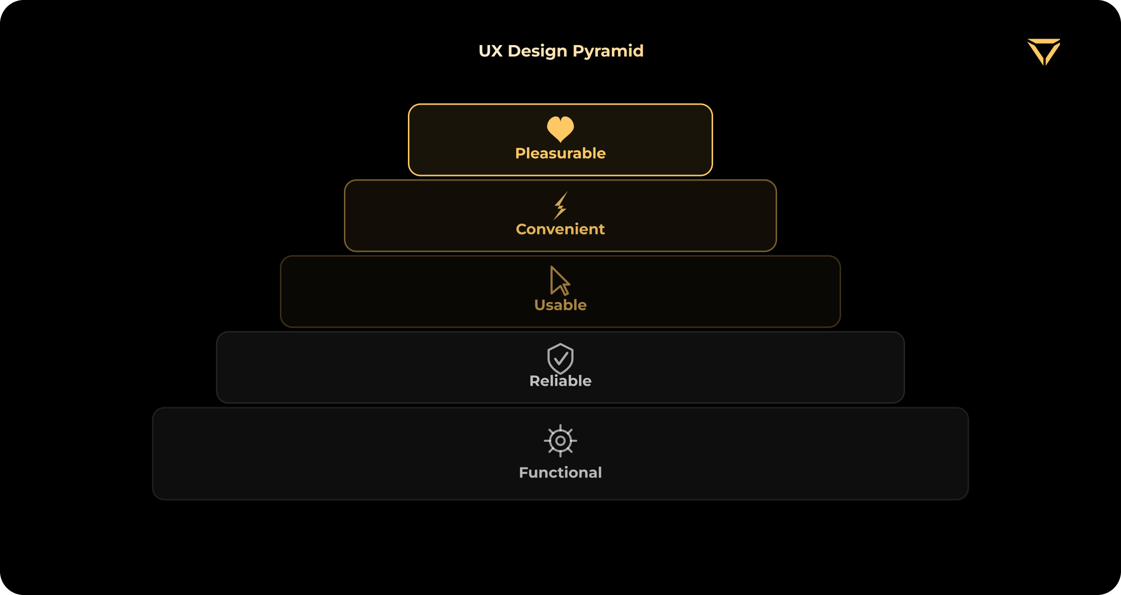
The 5 Layers Explained: Deep Dive into User Psychology & Metrics
Each level of the pyramid addresses a specific user question. But to truly manage product quality, product managers need to know usability principles and approaches to measure them. Let's break down the UX hierarchy of needs from the bottom up, drawing on fundamental product design principles. We will analyze Don Norman's work in detail and explain key product metrics.
Level 1 - Functional: "Does It Work?"
This is the foundation of the UX design pyramid. At this level, the product must fulfill its core task. According to The Design of Everyday Things, functionality is the root of any design. If a chair is beautiful but impossible to sit on, it's bad design. At this primary level, the user identifies a specific "pain" and expects a solution. Therefore, developers are required to get the job done.
A real-world example of this basic level is Uber. The core function is to press a button and get a car. If GPS doesn't detect your location or the call button isn't active, no amount of fancy animations will keep users engaged. An example of an unachieved solution at this level is an online store where the "Add to Cart" button doesn't work.
Key metrics to track:
- Task Success Rate (TSR): The percentage of users who successfully complete the basic flow.
- Bounce Rate on Key Product Pages: This is the percentage of users who land on a page with your core functionality, fail to complete their task, and immediately leave the site. This can be a checkout page, registration screen, or file upload form. If this rate is abnormally high, it's a red flag. Your core functionality is either technically broken or doesn't solve the user's problem, causing them to leave without further investigation.
Practical checklist of app usability:
- Does the core user journey work without blocking errors?
- Are critical input errors handled correctly? They may occur when the app is formatting phone numbers and emails.
- Are there clear loading states? The user should know that the process is ongoing, not frozen.
Level 2 - Reliable: "Does It Work Every Time?"
This level shows the stability and consistency of your digital product. It should work predictably on any device, at any internet speed, and under any conditions. This is where user trust is built. Here, the user expects security and predictability. Unpredictable system behavior causes anxiety and frustration that result from cognitive friction.
Real-world examples include Slack and Telegram. Messages should always be delivered instantly and without loss. If a messenger sometimes "eats" messages due to a poor connection, it's unreliable, even if it has a perfect UI.
Key metrics to track the reliability of your product:
- Crash Rate / Error Rate: Percentage of sessions that crash.
- System Uptime: Measures service availability. Many production applications target uptime objectives such as 99.9% or higher, depending on business requirements.
A practical checklist that will highlight UX design best practices or their violations:
- Are crash and error rates consistently monitored and kept at an acceptable level?
- Is the experience consistent across desktop, tablet, and smartphone? Your product should look and work the same on all devices.
- Is there basic support for low internet speeds with subsequent synchronization? For example, it could be offline mode or cache, which allows you to open previously viewed pages.
- Does the system restore user data if a tab is accidentally closed or the app crashes?
Level 3 - Usable: "Is It Easy to Use?"
This is where intuitiveness begins. The user shouldn't have to think about how to use the interface. While Levels 1 and 2 are the domain of developers and QA, Level 3 is the direct responsibility of the UX designers. They should reduce the cognitive load on the user when accessing your digital product. According to the laws of UX in general and Hick's Law in particular, decision-making time increases proportionally to the number of options.
Google's search bar is a good real-world example. It has just one input field and two buttons. Nothing superfluous. The counter-example is a complex enterprise software application whose interface resembles an airplane control panel. It may require as many as 10 clicks just to export a report.
Key metrics to track usability on this level:
- System Usability Scale (SUS): A standardized questionnaire for quickly measuring how easy your product is to use. The SUS consists of 10 statements (e.g., “I found the system unnecessarily complex” or “I think most people would find it easy to learn to use this product”). Users rate them on a 5-point scale from “strongly agree” to “strongly disagree”. As a result, you get a final score from 0 to 100. A score of 68 is considered the market average. If your product scores above 80, you have an excellent Usability level (L3). If it is below 68, the interface is overloaded, and you urgently need to reduce users' cognitive load.
- Time on Task: Lower completion time for routine tasks generally indicates better usability when task quality is maintained.
Practical UX design checklist:
- Does the interface pass the 5-second test?
- Does the product meet Nielsen heuristics, for example, is the system status clear?
- Are basic usability principles in relation to text contrast, clickable area size, and generally accepted icon patterns followed?
Level 4 - Convenient: "Can I Do It Efficiently?"
When a product is functional, reliable, and understandable, it's time to consider efficiency. The user already knows how to work with the product and now wants to spend less effort on routine tasks. They have a desire for control that will allow them to save time and gain a sense of empowerment.
A Notion AI workspace is among the good ux design examples. Advanced users can work at lightning speed without taking their hands off the keyboard thanks to slash commands (/), ready-made templates, and the ability to save their blocks and hotkeys.
Key metrics to track the convenience of digital products:
- Customer Effort Score (CES): An assessment of how much effort a customer puts into solving their problem.
- Feature Adoption Rate: Measures how many users adopt advanced functionality over time.
Practical checklist:
- Are repetitive tasks automated or optimized? An example of such tasks is autofilling shipping addresses.
- Are there shortcuts or filtering settings for advanced users?
- Is progressive disclosure used? It is necessary to avoid confusing newcomers and to provide more opportunities for experts.
Level 5 - Pleasurable: "Does It Delight Me?"
This is the top of the pyramid where emotional design lives. It is based on microinteractions, brand personality, tone of voice, appropriate humor, and animations that evoke a smile. According to NNGroup experts, "delight" only works when it's the icing on the cake, not when it's trying to hide the cake's poor taste. This level is forming emotional attachment, brand loyalty, and the desire to recommend a product.
Good real-world examples are Duolingo, a popular language-learning platform, and Asana, a project and task management platform. Duolingo has aggressive yet charming gamification, Duo owl animations, and streak sessions. Asana features mythical creatures that fly across the screen when you complete a task.
Key metrics to track UX delight:
- Net Promoter Score (NPS): Willingness to recommend the product to friends.
- Retention Rate: Long-term retention thanks to pleasant features that often bring people back to the product.
Practical checklist:
- Are microinteractions used to reward the user (e.g., haptic feedback and animation upon successful payment)?
- Do the interface and content convey the unique character of your brand?
- Are there any surprise moments that go beyond the simple task completion?
How to Apply the UX Pyramid at Each Startup Stage
Many founders and CTOs make the serious mistake of trying to implement all five levels at once. This leads to inflated time-to-market deadlines, a blown budget, and a situation where the product "makes a pretty face, but doesn't work." A proper UX design framework requires adaptation to the product's lifecycle stage and current business goals. Here's how to apply UX design for startups effectively and minimize risks.
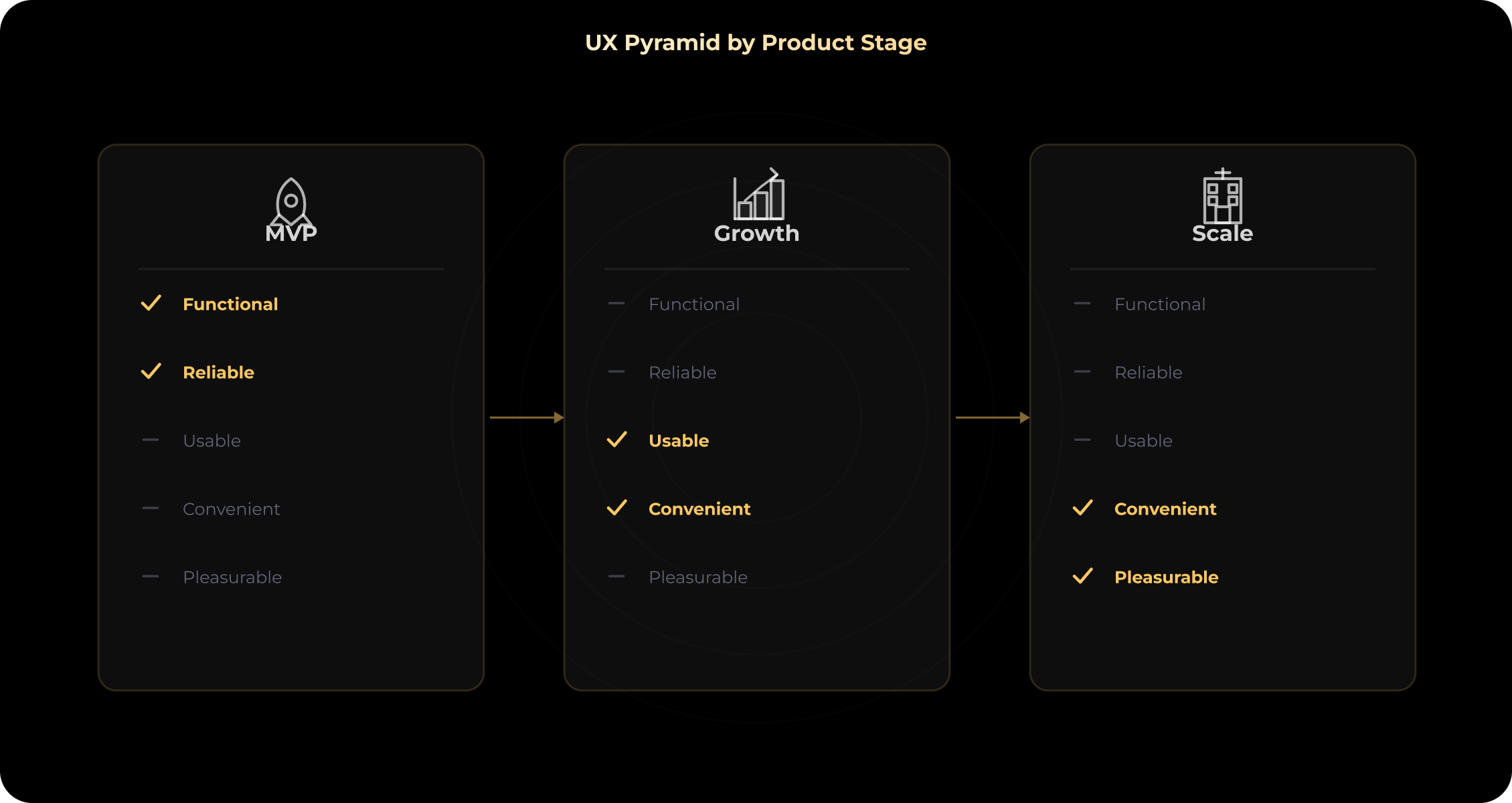
1. MVP Stage (Focus on L1–L2 + a pinch of L3)
During the minimum viable product (MVP) stage, your main business objective is to validate the hypothesis or product-market fit and prove value to early adopters. Focus on the Functional and Reliable levels. On this stage, technical debt is acceptable. So, your code may not be perfect, but the core experience must work flawlessly. Add some Usable (L3) features only to the core flow and onboarding.
What to avoid: Don't waste your budget on custom animations, complex point systems, dark themes, or personalization.
Our experience of building a fitness app shows that if you have an MVP, it's better to ensure the video workout doesn't interrupt during a call (Reliable) than to design pretty badges for completed lessons (Pleasurable).
2. Growth Stage (Focus on L3–L4)
The product has proven its value, the user base is growing, and unit economics are improving. Now you are facing a new problem: users are joining, but many are churning because they feel "inconvenient."
So, it's time to invest in Usable (L3) and Convenient (L4). Conduct a comprehensive UX audit. Eliminate friction, reduce clicks, speed up user experience, implement integrations with other services, such as Apple Pay and Google Sign-in, and personalize content. Reduce cost of acquisition (CAC) by increasing conversion and enhance LTV by making the product habit-forming.
3. Scale Stage (Focus on L4–L5)
You are a market leader or confidently moving toward one. You have strong competitors with similar functionality (L1) and high stability (L2). How to stand out?
As you scale and strive for absolute loyalty, the Convenient and Pleasurable levels come into play. Now you can hire motion designers, implement gamification, experiment with microinteractions, and build a strong emotional brand around the interface.
At the Scale stage, the business focus is as follows:
- Maximum retention. At this stage, users stay with you not only because the product technically solves their problem. Competitors already do this, and your target audience can potentially choose their products. They stay because they feel comfortable. Convenient saves them cognitive effort and time, while Pleasurable creates a lasting habit. As a result, the psychological cost of switching to another service becomes too high.
- Organic viral growth. People rarely tell friends and colleagues about apps that "just work without bugs." People share emotions. When your product delivers moments of unexpected delight, users voluntarily become brand ambassadors. This initiates a viral cycle and dramatically reduces customer acquisition costs (CAC). Among such features can be beautifully animated personalized statistics or a funny tone of voice in notifications.
- Building a "defensive moat". In today's IT industry, copying basic features is incredibly easy. Any startup with investment can clone your L1 (Functional) and L2 (Reliable) features in a matter of months. But competitors can't quickly replicate your brand's character, the microinteractions you've honed over years, and the audience's emotional connection with your interface. At the Scale stage, your unique user experience (UX) becomes the impenetrable moat that protects your business from competitors who may want to undercut you.
For example, Duolingo is a great example of proper timing. In its early years, it was a purely utilitarian, functional language learning app (L1-L3). They invested millions in methodology and stability. Only when they reached the Scale stage did they add extensive gamification, including leagues, streak freezes, and owl memes. This made their mobile app UX design a global benchmark and generated a billion-dollar market cap.
UX Pyramid Audit Checklist: Evaluate Your Product
Our specialists often use this pyramid as a standard framework for evaluating digital products. Work your way through the checklist from bottom to top. The first level where you answer "No" is your top priority for development.
Want to dive deeper into the audit? Explore our extensive UX/UI design services.
| Level | Evaluation Criteria (Pass/Fail) | How to Test in Practice |
| 1. Functional | Can users complete the main task without blocking failures? | Funnel analysis in analytics, manual testing of the core user journey. |
| 2. Reliable | Does the app run without crashes? Is there no data loss? Is the uptime >99%? | Bug monitoring (Crashlytics/Sentry), QA testing on different devices. |
| 3. Usable | Can new users understand the interface without instructions? | Usability testing, heuristic audit, 5-second test. |
| 4. Convenient | Can advanced users automate/speed up routine tasks? | User interviews, task time measurement (Task Time). |
| 5. Pleasurable | Does the product evoke positive emotions and a desire to talk about it? | NPS surveys, App Store/Google Play review analysis, mobile app UX design evaluation. |
Need a UX Review for Your Product?
Get a free 30-minute UX review with practical recommendations to improve usability and user experience.
Common Mistakes: When Teams Skip Pyramid Levels
Let’s explain in more detail why UX matters. Ignoring the pyramid sequence leads to wasted budget and user churn. Here are the four most common mistakes:
- Investing in animation (L5) when there are bugs (L2). A user will only be annoyed by beautiful falling confetti if their payment failed due to a server error.
- Ignoring Usability (L3) for the sake of shipping speed. Launching complex, intricate features "just to get it done" increases abandonment. Remember the basic UX design best practices: three well-functioning features are better than ten that don't.
- Designing for experts, neglecting beginners. If you jump straight to the Convenient (L4) level and overload the interface with shortcuts, new users may experience cognitive overload and leave.
- Blindly copying competitors. Implementing a complex points system and gamification system from a competitor makes no sense without preliminary work. Possibly, their product has been at Scale for five years and has long since reached L1-L3 levels.
How We Apply the UX Pyramid at Stubbs
At Stubbs, we build products with a deep understanding of how business goals intersect with user needs. Here's how our UX design framework works in practice:
Case Study 1: Smart Fitness Platform "OnTrack" (MVP Stage)
OnTrack is a wellness platform for smart weight tracking. Unlike traditional trackers that simply record numbers, OnTrack uses timeline predictions. These predictions show users whether they are on track to reach their goal within a given timeframe.
Our UX pyramid approach: Since the project was in the MVP stage (5-month development cycle), we strictly prioritized L1, L2, and L3. The visual delight (L5) was postponed to future releases.
- L1–L2 (Functional & Reliable). We laid a strong foundation on the Next.js, Node.js, and MongoDB stack. The core functionality worked flawlessly. We ensured responsive design across devices, the ability to import/export measurement history, and flexible record management. User data is securely stored and remains under users' control.
- L3 (Usable). Since our task was to minimize friction, we designed a simple, personalized onboarding. Users enter only a few data points, including current weight, goal, and deadline. We intentionally kept onboarding lightweight instead of adding unnecessary screens, reducing cognitive friction and helping users start tracking their progress faster.
- L4 (Convenient). Instead of forcing users to calculate their progress themselves, we implemented predictive insights. The platform automatically calculates the calorie deficit and the number of days remaining and creates an interactive visual graph using Highcharts. This transformed tedious data entry into an effective and convenient experience.
We convinced the founders not to waste their first release budget on complex gamification (Pleasurable level), but to focus on data value and intuitiveness. As a result, OnTrack has a robust, scalable architecture and a highly understandable core user journey. This will serve as the strong foundation for future integrations with fitness clubs and activity trackers.
Case 2: E-Commerce Platform "Anabolic Pharmacists" (Growth/Scale Stage)
Anabolic Pharmacists is a large e-commerce platform selling sports nutrition and pharmaceuticals. The project's main challenge (10-month development cycle) was its highly complex business logic. The platform needed to integrate promo codes, store credits, bulk pricing, gift items, and crypto payments into a single, seamless purchase process.
Our UX pyramid approach: Since this is a large-scale e-commerce platform, the foundation was ensuring that customers could reliably browse products, complete purchases, and make secure payments without interruptions (L1–L2). With that foundation in place, the design team focused primarily on improving usability (L3) and convenience (L4).
- L3 (Usable). Given the platform's rich features, our main task was to combat cognitive overload. During the Discovery phase, we analyzed market giants, including Amazon and local marketplaces, and identified a common problem. Their homepages were overloaded with promotions, which overwhelmed new users. To make the interface as intuitive as possible (Usable), we took a different approach. We created a clean, spacious structure in a contrasting black-and-white palette. Navigating the vast product range is frictionless thanks to an advanced filtering system that includes active ingredients, warehouse, and manufacturer.
- L4 (Convenient). Since checkout is where e-commerce loses the most money, we implemented a smart checkout. We automated complex pricing logic behind the scenes, including wholesale discounts, review credits, and promotional items, so users always saw the final price without additional calculations or extra steps.
Result: Instead of simply "drawing a store," we designed a sales tool. The platform combines a clean, minimalist design with a sophisticated pricing strategy and an affiliate program for influencers. Complex business logic doesn't disrupt the user experience, making the platform highly competitive in the market.
Our standard UX design for startups is focused on this effective pyramid: Discovery → Wireframes → Prototype → Test → Build.
Conclusion
The UX pyramid is a practical tool for product managers, CTOs, and founders. The rule is simple: build a solid foundation (Functional and Reliable), make the product understandable (Usable), easy to use (Convenient), and only then invest in emotions (Pleasurable).
According to widely cited Forrester research, every $1 invested in UX may generate up to $100 in return. And McKinsey Index also found that design-led companies consistently outperformed industry peers across several business performance metrics.
Building a product? Start with the right UX foundation.
If you want to ensure your product meets standards, get a free 30-minute review from our experts.
FAQs
1. What is the UX design pyramid?
What is the UX design pyramid?
It is a framework consisting of five levels of user needs: Functional → Reliable → Usable → Convenient → Pleasurable. It is inspired by Maslow's hierarchy of needs. The main principle is that each lower level must be fully satisfied before moving on to the next.
2. Who created the UX hierarchy of needs?
Who created the UX hierarchy of needs?
The concept was popularized by Aron Walter in his renowned book "Designing for Emotion" (2011) and expanded upon by designer Stephen Anderson. It is based on Abraham Maslow's (1943) fundamental hierarchy of needs.
3. How does the UX pyramid differ from Maslow's pyramid?
How does the UX pyramid differ from Maslow's pyramid?
Maslow's pyramid describes universal human needs from physiological to self-actualization. The UX pyramid describes user needs for a digital product, from basic functionality to emotional delight. However, the principle of operation is absolutely the same: the lower levels should always be addressed first.
4. What level of the UX pyramid should startups focus on?
What level of the UX pyramid should startups focus on?
At the MVP stage, focus on L1-L2 (functional + reliable). At the Growth stage, include L3-L4 (usable + convenient). Only at the Scale stage invest in L4-L5 (convenient + pleasurable). Don't invest resources in delight until you've built a solid foundation.
5. How do I audit my product using the UX pyramid?
How do I audit my product using the UX pyramid?
Work through each level of the pyramid strictly from the bottom up. Use our checklist, which consists of practical criteria. The first level that fails the audit should become your top priority for the next development sprints.
6. What's the ROI of investing in UX?
What's the ROI of investing in UX?
Investing in UX pays off enormously. According to Forrester Research, every $1 invested in UX yields a $100 return (ROI 9,900%). Furthermore, the authoritative McKinsey Design Index confirms that companies with a leadership approach to product design demonstrate 2x revenue growth compared to their competitors.
7. Can good UX replace good functionality?
Can good UX replace good functionality?
No. The UX pyramid clearly demonstrates that functionality (L1) is the foundation of everything. The most beautiful visual design or thoughtful micro-animations will never save a product if it doesn't physically fulfill the basic task the user installed it for.
Aug. 05, 2026
13:30 min to read